Showing posts with label art. Show all posts

Thursday, August 21, 2014

On the Road Again... Part 2


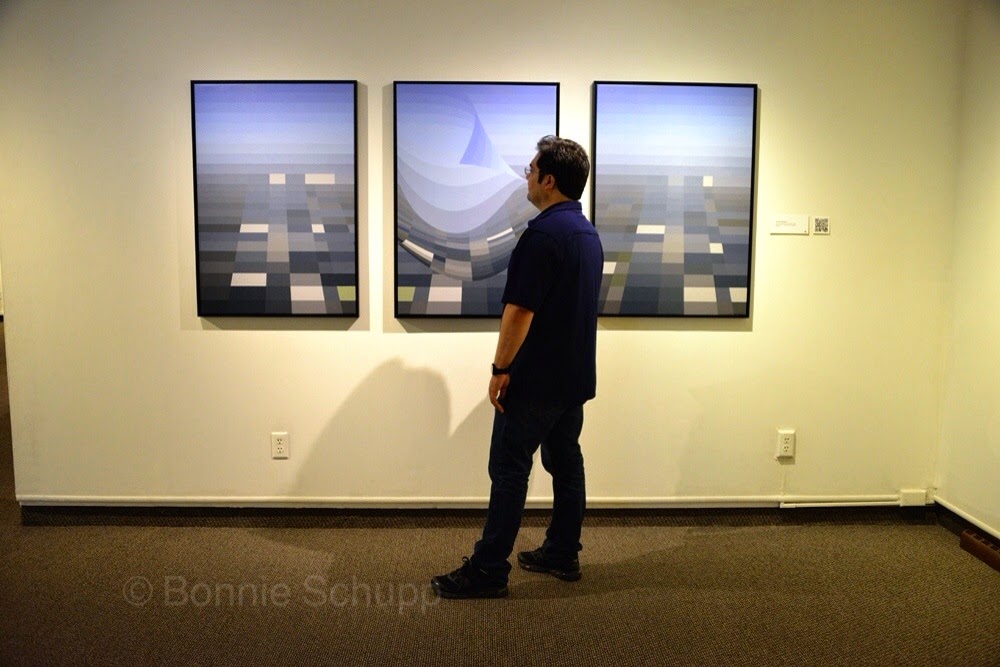
Petronio Bendito, with his three-panel rendering of New Orleans' Katrina disaster; and (below) the artist with his response to Haitian earthquake. (Photos by Bonnie J. Schupp)

Turning darkness into light:
Responding to tragedy through art


LAFAYETTE, Ind. – Petronio Bendito renders scenes of horror into art. Images of the aftermath from tornadoes, tsunamis, earthquakes are analyzed to create color palettes, and from this digital tray of paint strips the Brazilian-born artist creates powerful abstract imagery.

The shaking of buildings in 2005 in Pakistan becomes shimmering bands of ribbon in dark and light shades of collapsing concrete. The various-color  uniforms of an international group of rescuers surround the brown of the skin of a child being pulled from rubble of a Haitian earthquake in 2010. A man  carrying a child through floodwaters in China, 2007, becomes a powerful cocoon of red. A ribboned wave, the heavily blue swirl of water, curls over the coast of Thailand. There’s the raging orange/red of flames of the Colorado Springs forest conflagration. A seeming teardrop symbolizies the rush of water over New Orleans during Hurricane Katrina.

Our  friend Petronio, who teaches art here at Purdue University, is why we have come to Lafayette. Bonnie met him through the International Visual Literacy Association, a largely professorial group she joined while working on her doctorate in communications design a decade ago at the University of Baltimore. He participated in her “Defining Ourselves” project with an answer so simple yet profound (“I am all that I love.”) that we drove here a few years ago for her to take his related portrait photo. We’ve kept in touch through Facebook, and spent a day with him in Baltimore this year when he was presenting a program on color and algorithms at a mathematics conference. He’s brilliant, to say the least.

W had talked about his natural disasters project – using photographs of disaster scenes as the basis for creating art – and wanted to see the entire display, hanging through early September in the Art Museum of Greater Lafayette.  (It moves  later next month to the Central Features art gallery in Albuquerque, New Mexico.)

Petronio received an Indiana Arts Commission grant for the project, but early on found the work emotionally troubling – three months into the project unable to continue because it was overwhelming. But with the encouragement of friends, some of them psychologists, he managed to keep going. He developed an understanding that what matters is how one responds to disaster and tragedy – because life goes on, even though changed.


There is a glass case of the source photos next to the corresponding color palettes. And there are quotes on the walls, like this from Carl Jung: “I am not what happened to me. I am what I choose to become.”

And from author-motivator Leo F. Buscalgia: “There are two big forces at work, external and internal. We have very little control over external forces such as tornadoes, earthquakes, floods, disasters, illness and pain. What really matters is the internal force. How do I respond to these disasters?”

Buscalgia also is quoted: “Death is a challenge. It tells us not to waste time.... It tells us to tell each other right now that we love each other.”


And from an anonymous writer, the likes of whom are on seeming eternal proliferation through cyberspace: “You never know how strong you are, until being strong is the only choice you have.”

Petronio’s strength grew as he explored the world of tragedy, and says the lesson he took from it all was how he must respond – trying to improve the world in the aftermath, to heal.

One of Petronio’s observations: “Perhaps one of the greatest virtues is the alchemy of turning darkness into light, pain into lucid moments of reflections, loss into new findings and meanings.”

Also among the wall quotes, the artist adds: “The kaleidoscope of life gives us many color combinations, but we must pause to see them.”

Looked at closely, the art pieces are a journalistic distillation spun out in powerful arrays of color and motion instead of words.  Within his art lies great truth.

After our tour of the museum show, we split up for two hours – Petronio to deal with some matters of art and academia, while we explored Lafayette’s Main Street and found Jan Wright’s little shop of curiosities – First Class Clutter. Reminiscent of the eclectically surprising shops of used stuff and antiques in Baltimore’s Hampden and Fells Point neighborhoods, Clutter was almost as entertaining as Jan herself. She shared some of her collection of funeral photos – one of them showing a laid-out Al Capone – and, from her love of aviation, a few photos of the ill-fated Amelia Earhart taken at Purdue University.


                                                   Jan Wright, in her store First Class Clutter

Planes hang suspended from the shop’s ceiling, sort of flying over the bric-a-brac of American civilization that’s piled on shelves or hanging throughout the establishment. Old dish sets, boxed silverplate cutlery, sheet music, vintage clothing, photos of mostly anonymous people once stowed in boxes or mounted in treasured family albums – faces out of time, yet timeless.  I could have stayed there for hours, but our time was more limited – dinner and conversation were waiting, with Petronio and his partner Bryan Bell back at their home.

Lafayette is a lovely place, but the best part of travel for us remains the people we encounter and get to know as friends. They enrich our lives.


Thursday, November 3, 2011

Celebrating African-American art


Troy Staton, at right, looks at a some of the works in gallery show opening at Stevenson University. (Photo by Bonnie Schupp)

Barber’s love of art

leads to gallery show

Troy Staton Collection at Stevenson Univ.

is part of the Black Male Identity Project

Charlie Edwards has been a friend of Troy Staton since their childhood days in Baltimore’s historically black Cherry Hill section, and recalls him at age 14 -- cutting hair on the porch.

Three decades later, Troy is still cutting hair. But there’s a lot more to him than meets the eye at first glance.

Thursday evening, Stevenson University in the city’s nearly rural northwestern suburb celebrated another side of his life with the opening of a gallery show, “Black Male identity: Selections from the Troy Staton Collection.”

For years, Troy has been collecting the work of African-American artists and displaying it in his own gallery – the walls of the New Beginnings Unisex Barbershop on a corner across the street from Baltimore’s Hollins Market.

He’s a community activist, gives jobs to neighborhood kids, sponsors picnics, and subtly educates his customers about art. Children have visited art museums for the first time because of Troy Staton’s influence.

His latest barbershop show – scheduled to end by this weekend – is titled “Black Male identity: A Different Lens,” featuring perspectives through the work of five photographers, Andre Chung, Carl Clark, David Allen Harris, Robert Houston and Ken Royster. The compelling images show a universality of dreams, struggles and joys that transcends racial identity.

The Stevenson University show, featuring the work of more than a dozen terrific artists, continues through Jan. 6. I’ve seen some of them before, on the walls at New Beginnings. But this is the first formal gallery show for Troy’s collection. And Thursday night, he was beaming with joy at the experience amid a crowd of friends, family, and the university community.

He recalled the first time he began using the shop’s walls to bring art to the community, and feeling that “this is really something.” But seeing the artwork – representing about half of his collection – on the well-lit bright walls of a spacious university gallery was “incredible,” he said.

Both exhibitions are part of a series of area events in the Black Male Identity Project. Details can be found at its Web site, http://morethan28days.com.

Wednesday, September 9, 2009

Sprechen zie English? Road Trip Part 2


(Photo by a Chinese guy)
David and Bonnie join hands with tourists at East Side Gallery.


Backs against The Wall:
Close encounter of the
international kind


We visited Berlin's East Side Gallery Wednesday afternoon, and found first-hand just how topsy-turvy our world has turned in a mere 20 years.

The gallery consists of murals painted on a nearly mile-long surviving stretch of the Berlin Wall that cut through the heart of the city in a division of East and West -- nation and world -- from 1961 until its astonishing fall in November 1989 that led within months to Germany's reunification.

This section of the Wall blocked access to the eastern bank of the River Spree, a killing zone for anyone managing to cross the concrete barrier embodying the Cold War era's Iron Curtain.

Now there are gaps, one of which houses a souvenir house where tourists can pay to have an East Berlin stamp added to their passports. Another leads to a beach-style restaurant and beer garden.

We strolled slowly along the sidewalk on what once was deadly territory for those daring to attempt escape from East Berlin, and took in the more than 100 works of outdoor art. Then we stopped to watch a group of tourists posing for group pictures. They joined hands in a chain, with the wall art as a backdrop.

I offered to take the camera from one man so he could pose with the rest of his group, then Bonnie and I were invited to join in the human chain of hands, and our picture was taken in the group. We raised our linked hands together, strangers smiling together.

"Where are you all from?" I asked a seeming 40-something woman in the group, speaking slowly so she might understand my English.

"Welcome to China," she replied.

So there we were, global East meeting West at what once stood as the border of ideology -- communist and so-called free world.

You wonder how to say, in German or Chinese: "We´ve come a long way, baby!"


Thursday, November 6, 2008

Bonnie Blogistic Again: A Cloudy Turn-On


Word clouds give new look
to McCain, Obama speeches

But they're not up in the air

Think of these political speeches as art: Barack Obama's victory, John McCain's concession. But they're not so much for listening as seeing -- as "word clouds."

What in the world is a “word cloud,” you ask? Well, if you go to http://www.wordle.net/, you will read that “Wordle is a toy for generating 'word clouds' from text that you provide. The clouds give greater prominence to words that appear more frequently in the source text. You can tweak your clouds with different fonts, layouts, and color schemes.”

Here is a word cloud created from President-Elect Obama’s victory speech.


The text of the speech can be found here:
http://www.huffingtonpost.com/2008/03/18/obama-race-speech-read-t_n_92077.html

And here is a word cloud created from Senator McCain’s concession speech.

The text for this speech can be found here:
http://ap.google.com/article/ALeqM5hmJfimrZW3jBur_BmaFtqj7mfFgQD948JFJG5

And then I was curious about how David’s blog post, the letter to Barack Obama, would form as a word cloud. Here it is:

After I created these, I discovered that I wasn’t the only person to do this type of political art. A blogger created word clouds from the vice-presidential debate transcript (again, using Wordle). You can see the word clouds of Joe Biden and Sarah Palin’s here:

http://www.dailykos.com/storyonly/2008/10/3/0223/35665/837/618518

You can draw your own conclusions. Or you can go to http://www.wordle.net/ and "draw" your own -- having fun with whatever text you want to "cloud."

Enjoy!

Sunday, October 19, 2008

Road Trip Report, Part 5 (The Poster Boys)


Reinventing wheels
in political postering

Who's on First?
Of course, it's America!


“Country First” – nothing new about John McCain’s slogan.

Warren Harding used a similar one in 1920: “America First.”

Who would have guessed? Well, if you’re keeping up with the work of Steve Seidman, you’d see the poster politics of 2008 in a whole new (or old) light. Seidman – Dr. Steven A. Seidman – is associate professor and chair of the Department of Strategic Communication at Ithaca College.

And in a bit of wonderful timing, his four years of research produced just a month ago his book: “Posters, Propaganda, and Persuasion in Election Campaigns Around the World and Through History.”

While the book doesn’t quite make it to 2008, Seidman looked at the current campaign in a presentation this weekend on the Virginia Tech campus in Blacksburg, Va., at the annual conference of the International Visual Literacy Association (http://www.ivla.org/).

There really isn’t much new when it comes to the art of political postering – for example, the use of “gazing into the future” poses by both the McCain and Barack Obama camps.

Seidman compared an Obama “gazing” pose, powerfully angled from below in front of a flag background of red, white and blue, to the pose of President Gerald Ford on a black/dark background for his (doomed) 1976 campaign. Ford’s face was the only color in his poster; Obama’s face, though not brought up by Seidman, was in shades of black and white against a U.S. flag background.

At the bottom of the poster was the colorful Obama campaign logo, built on circles with a blue ‘O’ for Obama and a rising ‘O’ sun at its center – suggestive, Seidman says, of “a better tomorrow” and a symbol similarly used in election posters in many nations.

There is also an array of “guerilla marketing” posters springing up, sometimes illegally plastered atop others’ posters, around the nation – and being marketed by their creators. Among them is the popular “Abraham Obama” design by painter Ron English, combining the features of Abe and Barack and easily found online.

“The last time artists became so enthusiastic for a candidate was 36 years ago for [George] McGovern,” Seidman observed.

Among the images Seidman displayed in his PowerPoint presentation was a side-by-side comparison of an Obama poster for his July appearance in Berlin and a 1933 poster supporting the Social Democratic Party of Holland – both in what the professor said was the Bauhaus style.

“These styles always reemerge,” he said.

Seidman noted a recent story in the New York Times on campaign typography, and showed the McCAIN/PALIN poster design you see on lawn signs, bumper stickers, T-shirts and buttons. Its font, he said, is Optima bold – and described in the NYT article as “classic, elite and old-fashioned.”

The font is also used in the national Vietnam Memorial in Washington, Seidman said, “a strong, tough typeface.” And he pointed out the “very military” presence in of a gold star and braiding in the campaign design.

As for “America First,” the Warren Harding poster showed the 55-year old Republican in front of a billowing Old Glory with his right hand in a powerfully tight fist, and his left hand with thumb and two forefingers outstretched in what has become a recognized peace symbol (this campaign coming soon after the Great War). The slogan appears to the lower left.

Harding won, but died of a heart attack two and a half years after taking office and was succeeded by another, to put it gently, lightly-regarded president, Calvin Coolidge.

I noticed in checking out Warren G. Harding online that he seems not to have made much use of his middle name – Gamaliel. That’s a tough one. Hussein is a lot easier on the tongue.

For more on the art and design of political posters and propaganda, check out Steve Seidman’s blog at: http://www.ithaca.edu/rhp/depts/stratcomm/blogs/posters_and_election_propaganda/

His book is available in paperback ($33.95) and hardcover ($109.95) from Peter Lang Publishing USA (phone 212-647-7706), or through Amazon where the paperback can be had a few bucks cheaper.


Tomorrow: Healing after campus tragedies